
Behind the Scenes of a Creative Workflow: Tools That Make Life Easier
Creativity thrives with the right support. This post explores the simple tools and flexible systems that make a creative workflow easier, softer, and more aligned with your real life.
Creative life is beautiful — but let’s not pretend it isn’t also a little chaotic. Ideas fly around like confetti, deadlines sneak up like plot twists, and motivation sometimes goes missing like a character in a season finale.
That’s why creative tools and support systems matter.
Not to restrict you, but to anchor you.
The Everyday Tools That Keep Me Grounded
I don’t use anything overly fancy.
My creative toolkit is simple, but reliable:
Canva (yes, I side eye her, but she’s useful)
Photoshop
Google Docs
Calendar reminders
Weekly checklists
The occasional notebook page brain dump
These tools aren’t glamorous… they’re practical. And practicality keeps creativity flowing.
Systems That Support Creativity
I am not a rigid, color coded, hour by hour planner girl.
I’m a “structured freedom” girl.
The systems that work for me:
weekly resets
simple lists
project flow tracking
brain dumps
batching creative energy
clarifying steps before I start
It’s like blocking a musical scene — enough choreography to know where you’re going, but enough flexibility to improvise and feel the moment.
How I Reset When I Feel Burnt Out
The most effective tool I have is not digital at all:
Rest.
Space.
Time to breathe.
Sometimes I reset by bingeing a show.
Sometimes by painting.
Sometimes by music.
Sometimes by doing nothing at all.
I think this looks different for everyone. Burnout needs softness, not force.
What “Creative Support” Really Means
Creative support is not a single service — it’s an ecosystem.
It can look like:
helping someone brainstorm ideas
being an onsite photographer for a business
organizing content
helping a client untangle their thoughts
offering a fresh perspective
being a collaborator
keeping things feeling cohesive and inspired
Creative support meets people where they are — not where they “should” be.
Final Thoughts
Creative tools and support systems don’t need to be complicated or rigid. They need to be you shaped.
Your routine, your pace, your energy.
The goal is not perfection — the goal is flow.
And when you have the right tools and the right support, creativity stops feeling like pressure… and starts feeling like possibility again.
How Video Tells a Story — Even When It’s Under 30 Seconds
Short videos can still tell big stories. This post explores how emotion, pacing, rhythm, and visual intention turn even a 30 second clip into a powerful piece of storytelling.
Video editing has been a constant in my life — long before it became trendy, long before Reels and TikToks took over, long before short form video ruled the world. To me, editing has always been storytelling in motion.
It’s like piecing together a scene from your favorite movie or building a musical number where every beat matters. It’s intentional. It’s emotional. It’s craft.
Short Videos Can Tell Big Stories
A lot of people think storytelling requires time — long scripts, long clips, long explanations.
But some of the most powerful movie scenes are only seconds long.
Some of the most iconic music moments are tiny transitions.
Some of the best emotional punches come from silence, not words.
Short videos rely on:
emotion
pacing
mood
timing
visuals
subtlety
It’s less about duration and more about intention.
My edits live somewhere between:
clean
modern
emotional
cinematic
simple but intentional
My style shifts based on the story I’m telling.
Some videos need softness.
Some need playful rhythm.
Some need quiet beats in between.
Some need bold cuts and bright energy.
Editing is fluid — and that’s the whole beauty of it.
Editing Is More Than Trimming Clips
A lot of people think video editing is just:
cutting the beginning
cutting the end
But editing is so much deeper:
color grading
audio layering
intentional pacing
emotional timing
transitions
context
rhythm
visual mood
Editing is the invisible storyteller — when it works well, people don’t notice it. They just feel it.
Final Thoughts
Video editing is art.
It’s puzzle building.
It’s emotion weaving.
It’s storytelling in a language made of visuals instead of words.
And even in 30 seconds, it can say everything you need it to.
Showing Up Online Without Burning Out: A Creative’s Guide
Social media shouldn’t feel like a pressure cooker. This post explores how creatives can show up online with intention, honesty, and grace—without burning out in the process.
Social media is wild.
It’s vibrant and fun and full of inspiration — until it’s not.
Until it feels like homework.
Until it starts whispering, “Post more, do more, grow faster, keep up.”
Honestly?
It’s exhausting.
And I say that as someone who literally works in creative industries.
If you look at my Instagram right now… yeah, it’s been a while.
This post is not about pressure — it’s about honesty. About giving yourself grace. About building strategies that are realistic for your life, not someone else’s.
Consistency Starts With Honesty
The secret to consistency is knowing yourself.
If you’re someone who burns out quickly, a daily posting goal is not for you.
If you’re someone who needs spaciousness, batching may be your best friend.
If you’re someone with a full plate — motherhood, life, health, work — your plan needs to honor your capacity.
You wouldn’t start Wicked by belting the Act II finale; you’d warm up, find your range, build your stamina.
Social media is the same.
Why Social Media Feels so Hard for Creatives
Because social media requires:
emotional energy
creative output
time
vulnerability
consistency
planning
self-awareness
Creators give so much of themselves already — adding social media on top can be overwhelming.
And that’s okay to admit.
My Approach to Staying Sane (or Trying To)
I don’t show up perfectly.
I show up real.
Here’s what helps me:
staying ahead when I can
taking breaks when I need them
not punishing myself for needing rest
remembering social media is not life
giving myself space to binge a show guilt-free
Breaks do not equal failure.
They equal humanity.
Authenticity vs Aesthetic
You don’t have to choose.
You can be both.
Aesthetic is the structure.
Authenticity is the soul.
Your feed can look beautiful and still feel real.
It just needs intention — not pressure.
The Advice I Give Everyone
Give. Yourself. Grace.
You are not a machine.
You are not behind.
You are not failing.
You are not late.
You are living a full life.
You are creating at your own pace.
You are doing the best you can.
And that’s enough.
Final Thoughts
Social media is a tool — not a scoreboard.
It doesn’t get to measure your worth or your success.
Show up when you can.
Rest when you need.
Create from truth.
You’re doing great even if it doesn’t show up on the grid.
What Makes a Website Easy to Use? Small Details That Change Everything
A good website isn’t about flash—it’s about clarity. This post explores the small details that make a site easy to use, from navigation to layout to the overall flow of your brand's story.
Web design is one of those things people often overlook — until a website annoys them enough to click away. You know the kind:
six menus that all say the same thing
missing info
buttons that feel like riddles
layouts that make you scroll like you’re in an escape room
A good website shouldn’t feel like a maze. It should feel like walking into a well organized room — comfortable, intuitive, and clearly arranged.
A Good Website Is About Communication, Not Complexity
A strong website design is not about how flashy it looks. It’s about how effectively it communicates.
A good website:
gives information quickly
puts the most important things first
flows naturally from section to section
feels cohesive with the brand
is easy to navigate
reduces overwhelm
Think of it this way:
A website is the stage, and your business is the show.
Good design doesn’t distract — it highlights, supports, and elevates the performance.
Small Details Matter (More Than You’d Think)
Here are a few details I always pay attention to:
1. Not Repeating Information
Repetition is confusing.
If your website says the same thing in multiple places, the user begins to wonder if they’re missing something.
2. Variation in Layout
A website where every block looks identical? Snooze.
A website where every block looks totally different? Chaos.
The sweet spot is balance.
3. Back End SEO
SEO is the quiet librarian organizing the shelves — unseen but incredibly important.
What Makes a Bad Website… Bad
The two biggest problems:
1. Impossible Navigation
If finding information feels like a side quest in a video game, you’ve lost the visitor.
2. Missing Information
If someone lands on your website looking for hours, pricing, contact info, or what you actually do and can’t find it… they’ll leave.
People don’t come to websites for mysteries — they come for answers.
Squarespace & Shopify: My Forever Faves
I’ve been a Squarespace designer since day one.
It’s clean.
It’s intuitive.
It’s friendly for both designers and non-designers.
Shopify has recently become another favorite — especially for product based businesses who need robust e-commerce support.
Both platforms allow the design to feel like you while still giving users a good experience.
Designing a Site That Feels Like You
Designing a website is like developing a character for a story — you gather backstory, understand their personality, and make sure their environment reflects who they are.
To achieve a website that feels genuinely like the client, I:
ask tons of questions
gather references
look at their existing imagery
understand their tone
match their aesthetic
and structure the site around how they naturally communicate
It’s one step at a time — with the client’s happiness always at the center of the process.
Final Thoughts
A good website is an experience, not a container.
It’s designed to guide, reassure, and communicate.
It shouldn’t feel complicated.
It should feel like clarity.
And that clarity is what turns a website from a digital space into an extension of your story.
Branding as a Feeling: How Visual Identity Shapes Experience
Branding goes far beyond colors and fonts—it’s the emotional center of your business. This post explores how visual identity becomes a feeling, shapes experience, and helps your audience connect deeply with your brand.
Branding is one of those concepts people think they understand until they actually sit with it for more than thirty seconds. It’s not just colors and fonts (though trust me — I love a well paired font combo like a cozy cardigan). It’s not just vibes. It’s not a Pinterest board or an aesthetic or a logo with extra steps.
Branding is the visual story behind a business.
It’s the plotline.
The character arc.
The tone of the book.
Branding is what people feel when they interact with you — even if they can’t articulate it.
Branding Is the Emotional Center of a Business
If your logo is the book title, branding is the next few chapters — enough to pull your audience into the world and keep them turning pages.
Think of your favorite brands.
Why do you love them?
Why do they feel familiar?
Why do they make you trust them?
Chances are, they’ve built a feeling — clear, consistent, and deeply intentional.
For creatives, branding matters even more.
Because creative businesses aren’t built from spreadsheets and logic — they’re built from passion, personality, and connection.
Branding is the translator.
Branding Is Not One-Size-Fits-All (Red flag alert)
Anyone who markets branding as a universal template is missing the heart of the work. Every business has a different:
story
mission
personality
audience
emotional landscape
aesthetic language
Branding is not about forcing a vibe onto a business — it’s about uncovering the vibe that’s already there.
It’s like casting a musical. Different characters need different voices. Different brands need different expressions.
Common Branding Misconceptions (AKA: Things We Need to Let Go Of)
1. “Branding is just colors and fonts.”
No bestie, that’s decorating.
Branding is the meaning behind the colors and fonts.
2. “Branding is only for visual businesses.”
Branding is communication — it’s for everyone.
3. “Branding doesn’t need to evolve.”
Have you ever known a woman who stayed the same for 10 years?
Exactly.
Watching It Come Together Is Pure Magic
One of my favorite parts of branding work is seeing the final identity come together — the moment everything clicks. It’s like when a song finally gets its bridge or when a book reveals the chapter that ties the whole story together.
I’ve worked on branding for:
western jewel toned, cowgirl energy businesses
dainty, sparkly pink entrepreneurs
earthy, minimal, soft spoken brands
bold, maximalist creators
And so much more!
Each one feels like stepping into a new world — and world building is one of my favorite creative joys.
Final Thoughts
Branding is the emotional backbone of your business.
It’s not the aesthetic — it’s the resonance.
It’s not the colors — it’s the characterization.
When done well, branding feels like coming home to yourself.
And when you share that openly, your audience feels at home too.
What Makes a Strong Logo? A Creative Breakdown of Visual Identity
A strong logo is the opening chord of your brand’s story. This post explores what makes a logo memorable—clarity, intention, personality, and the creative exploration behind every great visual identity.
There’s something special about a fresh logo project. It always feels a little like standing at the beginning of a brand new song — before the melody settles in, before the lyrics find their rhyme, before the rhythm starts pulsing underneath everything. It’s that magical moment where anything is possible, where a single note could turn into an anthem.
That’s how I see logo design: the opening chord of a business’s story.
And while it might look small — a symbol here, a shape there — a great logo carries a surprising amount of weight. It’s the first impression, the first hello, the first moment someone meets your brand and thinks, Oh… I get it.
This post is all about that moment.
A Good Logo Is Clear, Intentional, and Full of Quiet Meaning
If you’ve ever walked into a bookstore, you know exactly how powerful first impressions can be. You scan the shelves and stop on the covers that speak to you. The same is true for logos. A strong logo conveys its feeling instantly — without yelling, without overexplaining, without trying too hard.
To me, a good logo is defined by:
Clarity — You understand the vibe in half a second.
Versatility — It works on websites, on packaging, on shirts, on everything.
Intentionality — Nothing is random. Every choice has a reason.
Personality — It matches the brand’s voice, whether bold, whimsical, earthy, or something else.
Balance — It’s not overly busy, nor painfully basic.
But let’s be honest: clarity isn’t simple. A logo is like writing the first line of a book — it looks effortless only because so much effort happens before that line exists.
The Beginning Is the Best Part (AKA: idea soup)
When I start a logo project, I gather information like a librarian prepping for a display. I ask questions, I explore vibes, I collect references, I listen. I want to understand the client’s energy so fully that when I finally start designing, it already feels familiar — like I’m translating something they’ve known all along.
Then comes my favorite part: the possibilities phase.
This is where I create version after version, stretching the aesthetic boundaries we’ve discussed. It’s messy in the best way — like the drafting stage of a song or the early sketches of a painting. Some ideas immediately make sense. Others flop beautifully. And some — the surprising ones — end up being the quiet stars of the show.
There’s a Wicked line I love, where Elphaba says, “I’m through accepting limits ’cause someone says they’re so.” That’s how the exploration phase feels. It’s where there are no limits yet. Only potential.
A Hot Take: I Don’t Love Borders
Okay, design confession:
I don’t vibe with borders on logos.
And no, not shapes — shapes are fun. Shapes are drama. Shapes are personality.
I’m talking about the “let’s trap the whole logo inside a little picture frame”.
Borders lock a logo into a rigid format. They reduce versatility. They make it harder to adapt across platforms. And sometimes, they take away from the elegance of the design itself.
It’s a personal philosophy, but after years of working with creative entrepreneurs, I’ve learned that flexibility is one of the greatest gifts a logo can have.
“It’s Just a Logo” Is an Absolute Myth
People sometimes say, “It’s just a logo. Just text. Anyone can do that.”
My whole design soul screams:
A logo is never just anything.
It’s the emotional shorthand for your business.
It’s the symbol people remember when they think of you.
It’s the tiny anchor point your brand lights up from.
A logo is a story compressed into an icon — a vibe condensed into a single image.
Who I Love Designing Logos For
My niche tends to gravitate toward:
photographers
e-commerce businesses
makers and product creators
But honestly?
I love anyone in a beginning.
Anyone in a reimagining.
Anyone who’s saying, “This is the start of something.”
There’s something beautifully about that moment and it’s a privilege to help shape it.
Final Thoughts
A strong logo is a mixture of clarity, creativity, and intentionality. It’s a melody, a moment, a mood — and it carries more meaning than people realize.
Designing logos never gets old for me because each one is a tiny world waiting to be built. And if you’ve ever wondered what happens behind the scenes, now you know: a whole lot of curiosity, exploration, and heart.
It’s the beginning of your story — and I’m always honored to help write that first line.
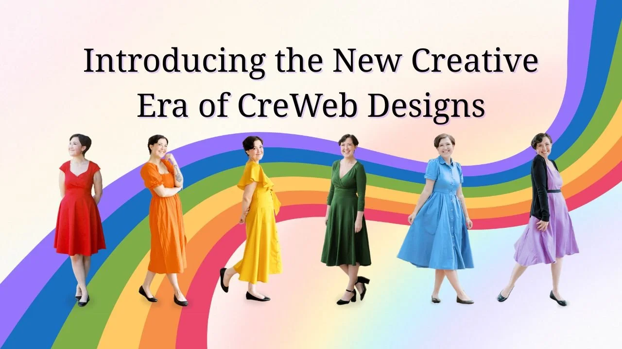
Welcome to the New CreWeb Designs — A Fresh Chapter, A Fuller Story, and a Cozy Place to Grow
CreWeb Designs has entered a new era—bigger, softer, and more creatively aligned than ever. This post is a warm welcome into the expanded CreWeb universe, where branding, web design, storytelling, and creative support come together in one cozy space.
There’s something magical about a fresh chapter.
Maybe it’s the Taylor Swift in me… the girl who loves an era shift, a dramatic reintroduction, a moment to say “this is who I am now.” Or maybe it’s the mom in me who’s learned that the slow, quiet transitions in life often end up being the most defining.
Whatever the reason, today marks the official beginning of the new CreWeb Designs.
Not a reset.
Not a redo.
Just… an expansion.
A softer, deeper inhale before the next scene begins.
Where I’ve Been(A Little Story About Life, Time, and Growth)
The last couple of years of my business have been quieter than the ones before it — not in passion, but more in pace. As my son has gotten older, our time together has shifted, stretched, and grown more precious. Kids hit new stages, and so do parents. Somewhere between school drop offs, doctors appointments, bedtime routines, and the million tiny moments in between, I realized I didn’t want to grind through every evening the way I used to.
And then there was my health — something I’ve had to learn to honor, not fight. New diagnoses, new symptoms, new challenges… they forced me to step back, not because I wanted to slow down, but because my body demanded space. And honestly? Giving myself that space might be the reason this rebrand feels so grounded.
But here’s the truth under all of it:
I’ve always been someone who learns by doing, and when I had to pause one part of my creativity, another part lit up. I explored new passions.
I painted more.
I wrote more.
I played music more — guitar, ukulele, piano.
I binge watched new shows the literal night they dropped (no regrets).
I dove headfirst into my love for movies — sci-fi, thrillers, musicals, anything with heart or high stakes.
I poured myself into storytelling, art, and self expression in ways I hadn’t before.
This rebrand is the result of all of that.
What’s Different This Time Around
CreWeb Designs used to be three neat little boxes:
logos, branding, and website design.
Now?
Now it's a creative universe. Because why not build a brand that reflects the whole spectrum?
CreWeb Designs now includes:
logo design
branding
website design
social media help
video editing
creative tools + support
(and, yes, the freedom to keep expanding)
This blog is the heart of that universe — a place where I get to share what I know, what I’ve learned, what I’m learning, what I’m exploring, and what I’m creating.
If CreWeb Designs was a bookshelf before, now it’s the entire Barnes & Noble — cozy chairs included, with a drink in hand and a stack of “I’ll just flip through this real quick” finds on the table beside you.
Who This Blog Is For (Spoiler: Probably You)
This space is for the creative entrepreneur who’s juggling ideas like mismatched socks.
It’s for the mom who’s trying to build something meaningful while raising tiny humans.
It’s for the women who grew up on Tumblr, love a good era change, and still get emotional at the Wicked soundtrack.
It’s for the people who binge watch shows the minute the new season drops.
It’s for the person who has always felt multi-passionate but never sure where all their passions “fit” in a business world that loves rigid lanes.
It’s for anyone who wants to learn, grow, create, reset, reimagine, or explore.
It’s for the person who just wants a cozy corner of the internet that doesn’t demand a credit card or a subscription to exist.
It’s for you.
Why This Blog Exists
Here’s something that’s always bothered me about the online business world:
The constant asking.
Give me your email.
Subscribe for the answer.
Unlock this content.
Join this membership.
Access this download.
Buy the course.
I don’t want that.
I want to give.
I want to teach.
I want to connect.
I want to share what I know freely, because creativity should be accessible, not hidden behind a paywall like some exclusive club.
My passion isn’t just designing for people — it’s helping people understand design, creativity, systems, and themselves.
I want this blog to feel like the friend you go to for creative clarity and emotional support. Someone who gets it. Someone who has been there. Someone who will talk to you honestly, openly, and without judgment.
Think of this blog as a creative journal meets design textbook meets coffee shop conversation.
A Little More About Me (Because I’m Part of This Story Too)
I’m a mom.
I’m Native American.
I’m someone who built this business to help fund my son’s first open heart surgery — and stayed for the love of design and the community I found along the way.
I love branding and web design…
but I also love painting, music, movies, writing, and storytelling.
I’m a Swiftie, always in at least one era at a time.
I’m a lover of stories — whether they’re in the pages of a book, the frames of a movie, or the pixels of a website.
I’m the girl who will absolutely stay up until 2 AM finishing a show because “I need to know how this ends.”
Everything I am creatively has poured into this rebrand.
What You’ll Find Here
Topics like:
understanding design in simple ways
creative analogies that just make sense
tips that help you feel less overwhelmed
the behind the scenes truth about branding
website insights that don’t make your head explode
realistic social media perspectives
video editing storytelling basics
creative tools that actually help
reflections, stories, and honest conversations
I want this to be the place you land when you want to feel inspired, understood, educated, supported, or just quietly creative for a few minutes.
Final Thoughts (The Soft, Gentle Kind)
If you’re here on launch day, reading this, thank you.
It means you’re part of this chapter — not just as a reader, but as someone who believes in creativity, evolution, and new beginnings.
This space is soft.
This space is safe.
This space is personal.
This space is meant to grow with you — not pressure you.
So whether you’re here with coffee, with a half finished project beside you, with a kid napping in the next room, or with a show paused mid episode because you needed a breather — welcome.
CreWeb Designs has entered its next era.
And I’m so glad you’re here to experience it with me.